A friend had an AI-generated logo she loved. She needed it in the formats that turn an image into something a business can actually use.
The original was a PNG. The full logo combined a tree, two faces, a dense canopy, interwoven roots, several bands of landscape, typography and botanical ornament. She also needed a secondary logo and a standalone brand mark. Each version had to work as an editable SVG, a print file and a transparent image at several sizes.
I said yes because it sounded fun. I also assumed that the first useful step would be fairly mechanical. Trace the image, clean the paths and separate the variants.
I was wrong about the tracing part.

The tools gave me paths, not a logo
I tried the obvious route first. Free online vectorisers and paid tools could turn the coloured regions into paths, but none produced a useful basis for the finished assets. Fine branches disappeared. Roots became heavy blobs. Watercolour texture turned into thousands of small shapes. The files were technically vector graphics and practically awkward to edit.
That result makes sense once the task is stated properly. A tracer sees changes between neighbouring pixels. It does not know that one gold line is a face, another is a root passing behind the trunk, and a third is a highlight that should move with the branch beneath it. It cannot recover the intended relationship between the emblem and the wordmark. The PNG no longer contains those decisions.
The first task was reconstruction. I had to infer which parts of the image were meaningful, which could be simplified and which variations belonged to the texture rather than the shape.
The first AI-assisted result passed the wrong test
My first Codex run used a layered colour trace with a cleaned ring and separate lock-ups. It produced all three requested variants. The SVGs parsed correctly. A manifest accounted for the files. Pixel comparisons reported relatively small average differences from the reference.
Then I looked at the raw comparison.
The roots and trunk were much heavier than the original. Fine branches had vanished. The face lines were coarse. The outer ring looked scratched rather than drawn. At normal viewing size, the result was plainly wrong even though several checks were green.

One later audit found an even more specific problem. An internal check for part of the trunk had compared copied guide geometry with the authority rather than measuring the paths it claimed to evaluate. The check was consistent. It was also looking at the wrong thing.
I rejected the package and started a controlled rebuild. That decision mattered more than any individual drawing technique. It moved visual judgement back above the measurements.
The workflow began to remember
The rebuild treated the original PNG as the visual authority and separated the emblem into named parts: frame, landscape, trunk, internal ribbons, branches, roots, faces, foliage and finishing details. Typography and the lower ornament came later.
More important, each round left behind working knowledge. A status file recorded which layers had passed, which remained provisional and why. Rejected experiments stayed outside the deliverables. Layer specifications captured boundaries and crossing relationships. Review notes recorded the visible problems that the next pass should correct.
I used an orchestrator to coordinate the build and its reviewers. It did not learn by changing its trained model. The project accumulated checked artefacts, decisions and constraints that the orchestrator and later workers could read. Starting a continuation no longer meant explaining the logo again or trusting a compressed account of what had happened.
This also exposed a mistake in my first approach. I had made the review too granular. Agents spent too much time validating ambiguous painted details before the emblem worked as a whole. Context and effort went into deciding the exact meaning of marks that barely mattered at the size the logo would be used.
I changed the cadence. The build would reach a recognisable milestone, render at native size and 256 pixels, make one aligned overlay, identify the five largest visible discrepancies and correct those. Minor bark streaks could remain approximate. A complete silhouette mattered first.
Luna did the repetitive work
Partway through, I moved the main construction run to Luna. It was the cheaper and faster option available to me, and much of the remaining work was repetitive: edit paths, render the composite, compare it with the reference, adjust placements, rebuild the exports and run the checks again.
That move sped the work up, but Luna was not dropped into the original vague request. By then the project had an authority image, approved layers, naming rules, rejected approaches and a clear next milestone. The cheaper model had less to infer and less permission to wander.
I kept review separate from construction and used subagents in narrow roles. One could build while another reviewed the assembled result independently. They did not all comment on every leaf. Reviews happened after the emblem skeleton, the completed emblem, the typography and the export package.
The useful division was not smart model versus cheap model. It was discovery and judgement versus repeated production.
My role did not disappear. I still decided when a comparison looked wrong, which differences mattered, when a strict geometric check was protecting the design and when it was chasing a painterly accident. I also chose where the result could honestly claim fidelity and where it remained an interpretation.
The vector package was not the ending
The controlled rebuild reached an export milestone. It had named layers, reusable leaves, outlined typography and a clean set of variants. It was far easier to edit than the automatic trace.
I still did not like it. The tree had become sparse and rigid. The broad branches, straight roots and repeated leaves made it feel assembled from parts. The file problem had been solved, but too much of the original character had been traded for editability.

This became a second rejection. I kept the vector package because it remained useful for flat-colour, embroidery and other production work. I stopped asking it to carry the full visual identity of a painterly source.
The organic work had to come back together
Breaking the logo into semantic layers had helped me understand it. Rebuilding every organic part separately had also removed the relationships that made the tree feel grown rather than assembled.
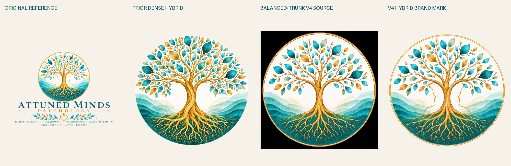
I changed method again. Instead of drawing another set of branches and leaves, I used image generation to create the tree, canopy, trunk, landscape and roots in one cohesive pass. The original supplied the visual reference. A detailed prompt preserved the composition, palette, facial negative spaces and root density while excluding text and the lower lock-up.
That did not produce the answer in one attempt. The candidates moved through a dense organic version, a simplified version, a balanced-density version and finally a balanced-trunk fourth version. The later working knowledge still mattered. It gave each correction a specific target instead of asking the model to make the picture vaguely better.
The final answer was deliberately hybrid
The final option used the organic raster emblem where painted cohesion mattered and retained vectors where exact geometry mattered. The approved double frame, face contours, wordmark, subtitle, ornament and supporting copy remained vector. The generated source omitted the face contours so the approved contours appeared once, cleanly, above the painted tree.
The build separated the organic artwork into bounded landscape, wood, root and foliage plates. It excluded the generated rings and square corners, then fitted those plates inside the authoritative vector frame. Linked SVGs kept the texture plates separate and replaceable. Self-contained SVGs embedded them for portability.

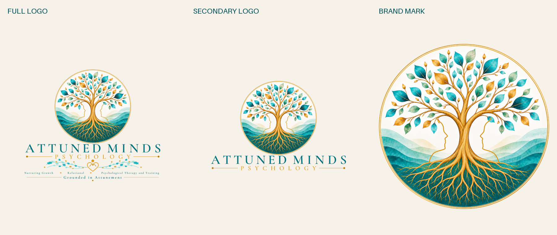
The hybrid package included linked and embedded SVG masters, print PDFs, transparent PNGs, light and dark previews, font and colour information, manifests and visual checks. It was still an export milestone rather than proof that every printer or embroidery machine would reproduce it correctly. Those checks belong with the vendor and the physical output.
The cheaper model was only part of the saving
It would be easy to reduce the result to a model-selection tip: use Luna for the grunt work and reserve slower review for the milestones. I do expect to use that allocation again. It is not the whole explanation.
Luna became effective after the work had been made legible. It could read what earlier attempts had established. Subagents had different jobs rather than several chances to produce the same opinion. Review moved to points where the whole image could answer back. My own judgement remained responsible for accepting the result.
A simple flat icon may still be handled perfectly well by an online vectoriser. Another creative task may need a stronger model throughout. This was one complex logo, worked on over two Codex tasks, so it is not a benchmark for models or tracing software.
It did give me a more useful way to think about model cost. The cheapest run is not necessarily the one with the cheapest model. It is the run that avoids rediscovering settled decisions, gives repeated work to an appropriate model and spends scarce judgement where a wrong answer would carry forward.
The useful saving did not come from using Luna everywhere. It came from giving Luna work that no longer required rediscovering the design, then changing method when the reviewed result still looked wrong.
The logo did not become usable because the workflow produced more paths. It became usable because each reviewed result narrowed the next decision without trapping the work inside the previous one.